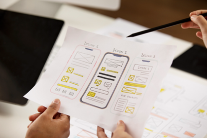
Generally, corporate processes are incredibly complex and so to visualise them with sub-par or no tools will make this task much harder than it needs to be. The most critical component of any tool is the UI (User Interface) that the user will use to map out their processes and make future decisions based on what the outcome looks like. Get this right and adoption becomes easy.
There are many different tips and tricks that someone can use to ensure that their UI is well designed and intuitive. Here are some of them:
– Conduct user research and know exactly who you’re designing for.
– Organise and prioritise the information that will be presented throughout the process.
– Focus on usability above all else – get this right first and everything else will follow
– Design for mobile-first – most process interactions will be in the moment and on smartphones
– Navigation areas should be clear and easy to find – don’t assume it’s obvious just because it is to you!
– Ensure high visibility of important process elements – it needs to be clear what the next step is at all times
Following the above can provide many benefits to a tool and/or company as a user will want to adopt such a tool. It will provide an increase in productivity and customer / user satisfaction if a tool is not indirectly inhibiting them from achieving their process goal. Other benefits could include:
– Acquisition of new customers – users talk to their colleagues about great experiences
– Increased customer retention – they’ll keep using it if it’s easy
– Lower development and training costs – the better the UI the quicker and easier it is to learn
– Lower customer support costs – fewer calls from people who are struggling
Along with the benefits that good UI design can provide, in contrast, poor UI design can be a big detriment to a tool or a company’s reputation. Not following the above will stop any traction within the consumer space that your tool has until these issues have been rectified.
The UI is a key focus for our tool Okuda which is extensively tested with users to gather feedback and suggestions for further improvements to make it more intuitive and easier to navigate. More information about Okuda can be found here: https://www.maly.co.uk/okuda
How to create a superb UI for a process visualisation tool?

